Overall Comments
You have taken on board my comments about being careful
stretching the brief - to do so with a rationale - and reverted to a more
straight-forward interpretation. This is fine and you have produced a perfectly
good and reasonable narrative of Lincoln cathedral. However, In doing so, you
have lost a little in terms of showing your individuality of approach that sets the work apart from
the norm. You need to maintain your individuality of approach but on the basis
of a well argued rationale.
Feedback on assignment
You have a good set of images that are a mixture of
standard and more personal views. There are technical issues with some of the
images that I will discuss below.
What is lacking in your assignment is a discussion of the
reasoning behind your work and how the work of other photographers have
contributed to it. For example, you give no indication of how the images’ size
might vary or why you chose a night scene of the cathedral as your opening
image as opposed to the more conventional daylight view. I’m not suggesting
that the first image is wrong - It does show an individuality of approach which
is good. But why this as the opening image to the magazine articles and how
would its size relate to some of the other images? It’s these sort of questions
that should be covered in your learning log.
The sequencing of the images is a natural progression as
if you were being taken on tour which is good. In image 1 although strong in
terms of showing the cathedral in a less traditional night scene with it
towering over the smaller buildings, there are some technical problems: You
might want to straighten the towers. You could also consider straightening the
verticals that are currently converging. Being a night scene you have used a
high iso setting which has resulted in quite a lit of noise in the image. As an
opening image in the magazine this is a definite disadvantage. It would have
been better to have used a lower iso, put the camera on a tripod and used a
long exposure. There are other views of to establish the setting of the
cathedral - see the Wikipedia links - http://en.wikipedia.org/wiki/Lincoln_Cathedral
It would have been instructive to see
your discussion of these images and your argument for choosing the images you
have as part of your log.
You have several strong images - image 2 the view of the
naive towards the organ. Although fairy traditional it does convey the size and
grandeur of the interior very well. Interesting to have included the blue tape
barrier? was this a conscious decision? You could perhaps have taken the
picture from in front of this to avoid it.
Image 3 is perhaps falling between two stools - its not looking
down enough to show
the whole front door, nor is it looking up enough to show
the tops of the towers and making a strength of converging verticals. Having
Image 3 to show the height and grandeur of the building you might have
considered concentrating more on the detail of the entrance. and included the
bottom of the door and any steps.
Image 4 is another strong image that shows a more
individual view with its strong graphical shapes and lines. However I’m not
convinced that this is the best illustration of the point being made in your
caption - detail. I would say that a close up detail of the stone carving might
be a better illustration. See one possibility in this link http://en.wikipedia.org/wiki/File:Lincoln_imp.jpg
Image 5 conveys a good feeling of peace and calm showing
that there are places for quiet contemplation. Images 6 and 7 are good strong
images again giving a good feel for the size and different sections of the
spaces in thecathedral.
However image 7 does look a bit warm in colour temperature
(as is image 8 where it shows particularly strongly) and you might consider cooling
it down a little. Also, if you were wanting specifically to illustrate the choir
stalls a straight on closer view might have been better. I appreciate that this
might not have been possible in the circumstances and again this is something
that you should be discussing in your log.
Image 9 showing the organ pipes has made good use of
composition turning the picture so that the pipes make a good strong diagonal
with the top of the central column coinciding nicely with the apex of the
vaulted ceiling. Did you consider trying to get a picture of the organ keyboard
as an alternative?
Images 10 and 11 - people during a service. I think that
image 10 is the strongest composition showing the preacher in action with
members of the congregation out of focus in the foreground. However the image
does suffer from the noise associated with high iso settings and an overly warm
colour temperature. Image 11 is good in capturing nice side lighting on the
figures, but I’m not convinced about cropping their bottom halves so tightly
and the image needs rotating slightly to straighten it. I would consider
dropping image 11 and moving straight on to image 12 a good image showing the
aspect of tourism playing a part in the cathedral.
Images 13 and 14 are good strong images showing unusual
views. Would you consider using image 14 on its own and not using image 2 as
they both show similar views just from different viewpoints. You need to be
thinking of how each image in the magazine tells part of the story and these
images could be said to be duplicating the message. Images 16 and 17 both show
interesting and different aspects of detail of the cathedral. In 16 attention
seems split between the bell ropes, the furniture and the framed images on the
wall you might have bee better to have concentrated on just one of these.
You have done well in 17 to show a more unusual angle and
crop of the stained glass window.
The last image while rounding off nicely the magazine
article does to some extent duplicate image 5 and you might want to consider
dropping one of these.
Learning Logs/Critical essays
As I have already indicated your log could do with more
discussion of your rationale for choosing these images - there is no
commentary relating to the actual assignment.
In relation to the exercises leading up to the assignment
It’s good to see your review of other photographers work but again, you could
include more commentary on how this influences your own work and what
you might do
differently. You are starting to record comments about
what you are wanting to
say which is good but you need to expand this more to
elucidate and refer to
other people’s work in this Student feedback
Following a review of the Tutors Report the following changes were considered:
The first, front page image was changed to a daytime image. My reasons for choosing a night time image was that when lit the cathedral is even more striking to the viewer than in the daytime, increasing the impression of size and grandeaur, also it was a little different from the usual image I'd seen before. Due to the amount of noise associated with the image I'd taken, which in retrospect I should have produced with a tripod and long exposure time, I decided to replace it with one of the same scene but taken in the daytime. For this image, I manage to convice the staff on the gate of the castle to let me in free for a few minutes for the sole purpose of taking this image from the walls on the cathedral side. I set up my tripod, which was a little tricky as the exact spot I wanted to take the image was between two points where the ground wasn't exactly even. I had seen this shot on several items of tourist literature so thought I'd try to reproduce the same. I didn't have a great deal of time to take the image, but was relatively pleased with the result, although I did straighten it slightly in Lightroom.

The image taken at the front of the cathedral, which didn't include all of the door or all of the towers, I had intended to re shoot this image but as the restorative programme has progressed further across the front of the cathedral, this won't be possible.
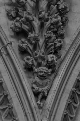
My tutor commented that image 4 talks about detail but I might have been better placed to include a close up of some detail within the cathedral, the infamous lincoln imp, which is pretty high up so a telephoto was required. I took the image in black and white in order to highlight the carving of the imp, although not as sharp as I'd like it was a case of take the image quickly before the next tourist puts 20p in the machine and lights the imp up as way of identification, not good photographic lighting.
The image of the people watching the preacher is to be dropped from the assignment, as my tutor commented, its too similar to the previous image, allowing better flow onto the image of the tourists during a tour.

No comments:
Post a Comment